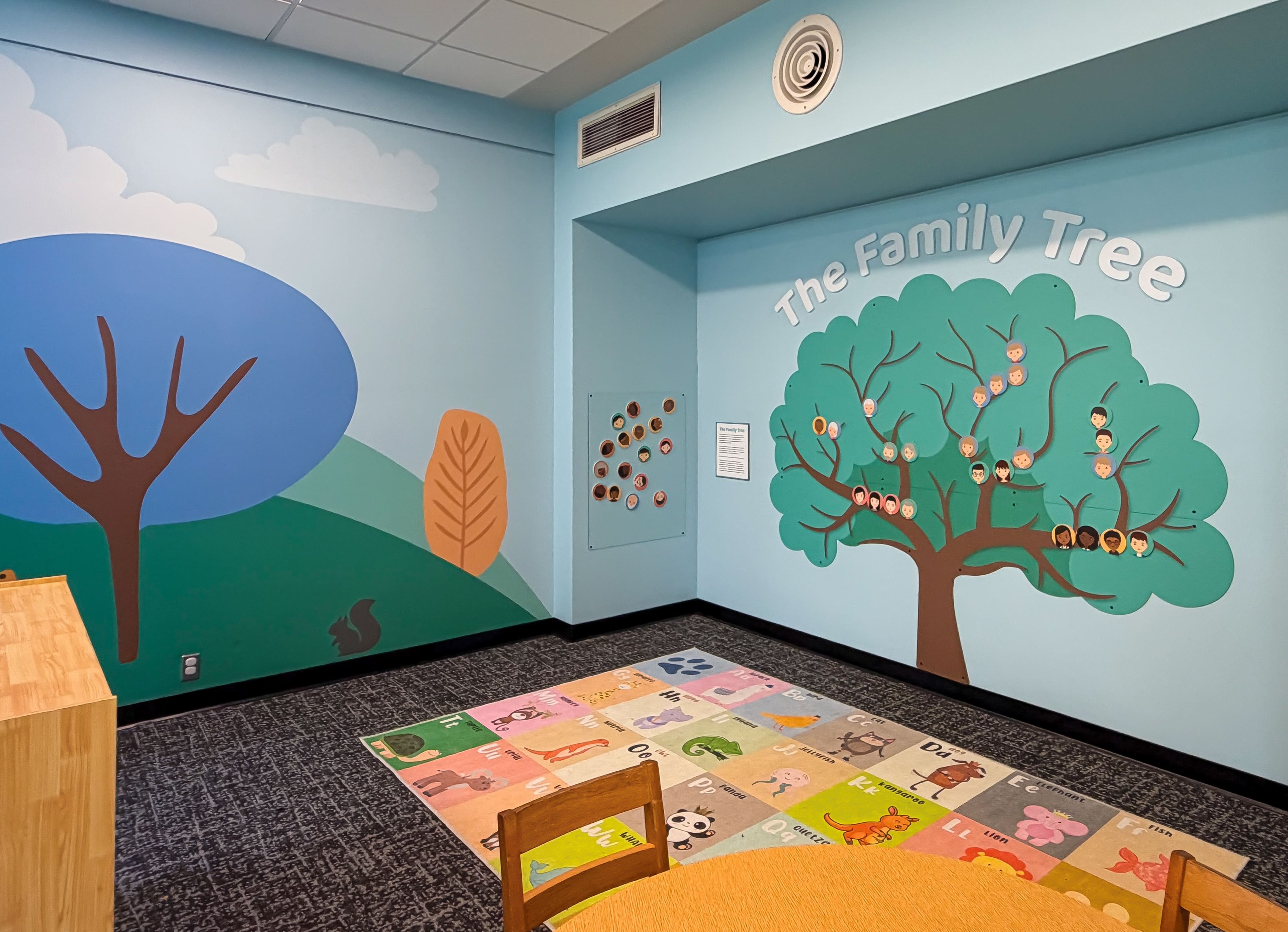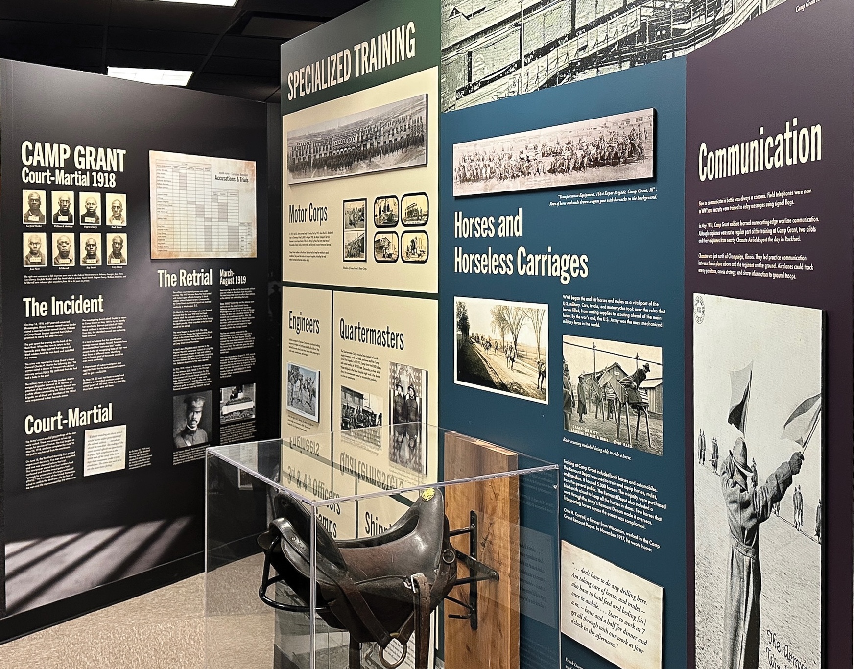
These projects bring an organization’s identity, stories and personality into its physical spaces through environmental graphics, illustration and dimensional elements. Each responds to the existing architecture, balancing a consistent visual language with the character and practical needs of the setting.
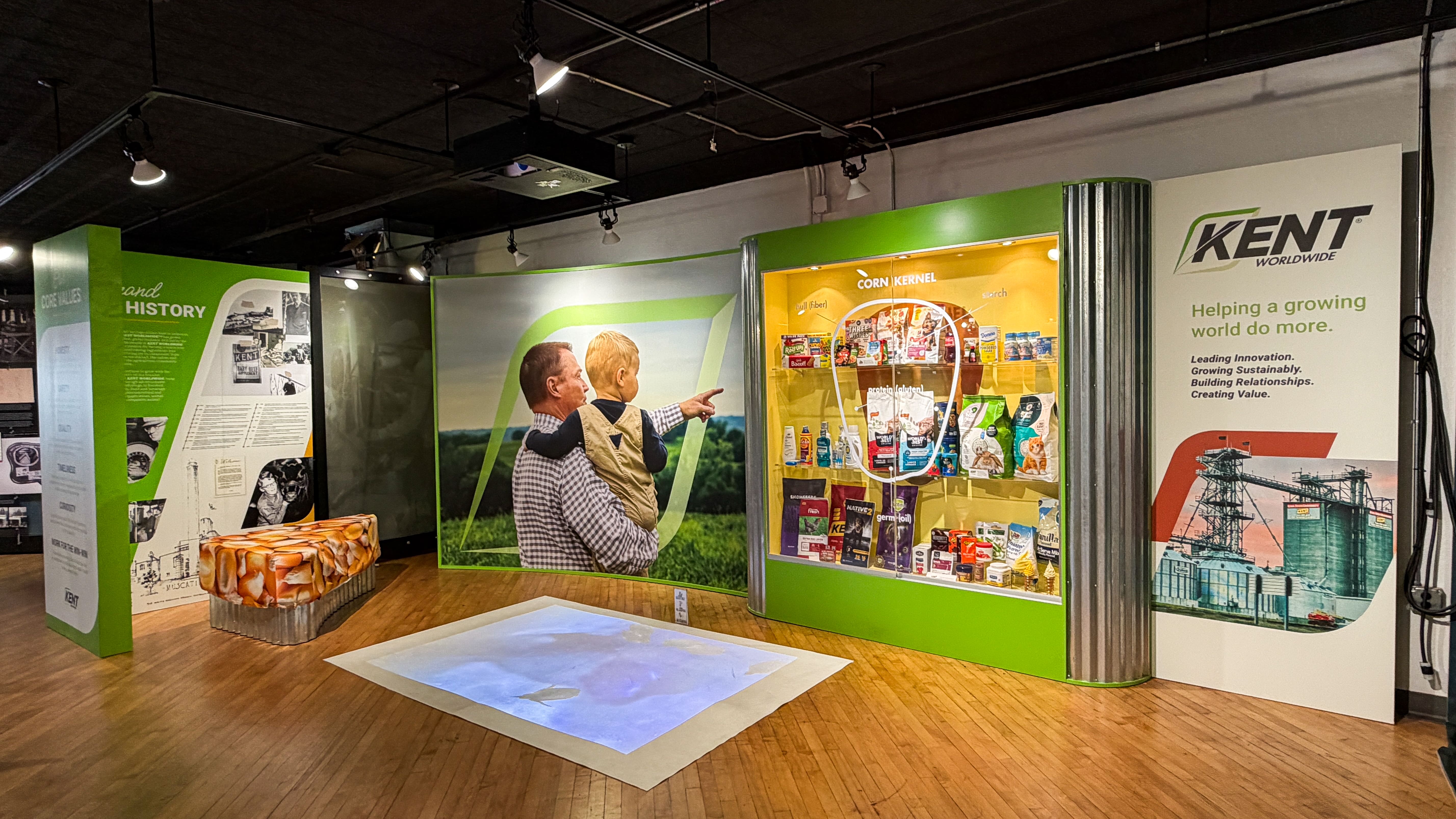
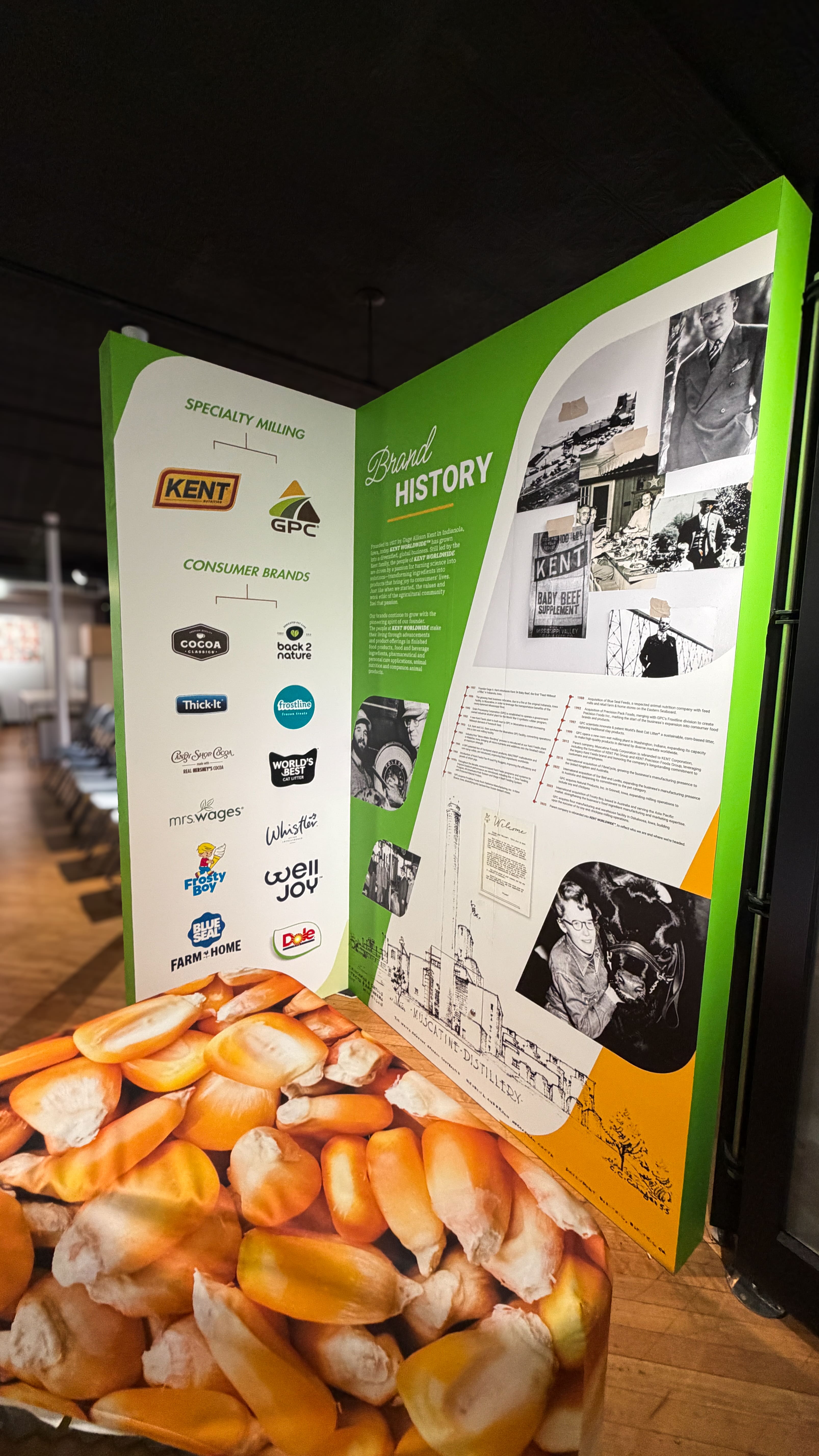
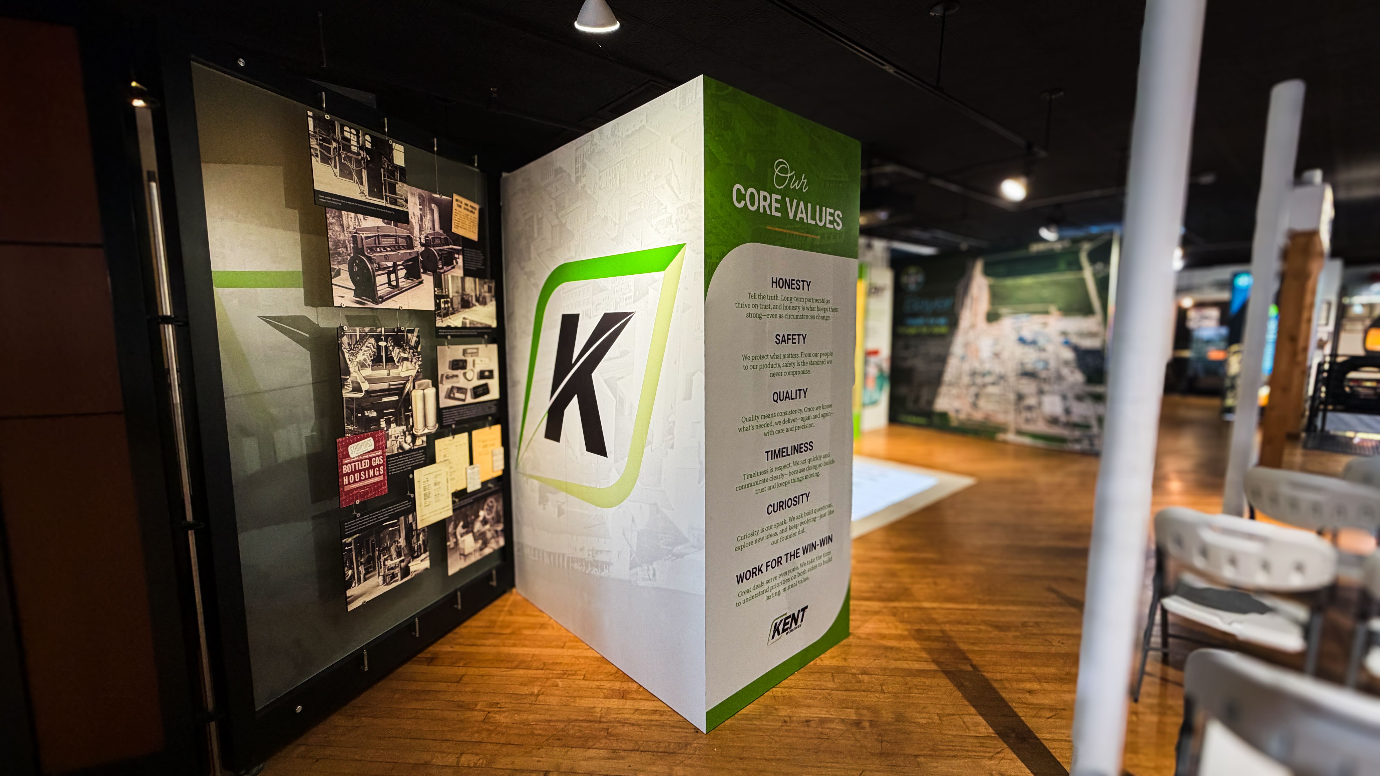
I translated Kent’s brand language into environmental graphics at The National Pearl Button Museum. The mini-exhibit brings company history, values and imagery togetherextending the identity into a physical experience while keeping historical content clear and approachable.
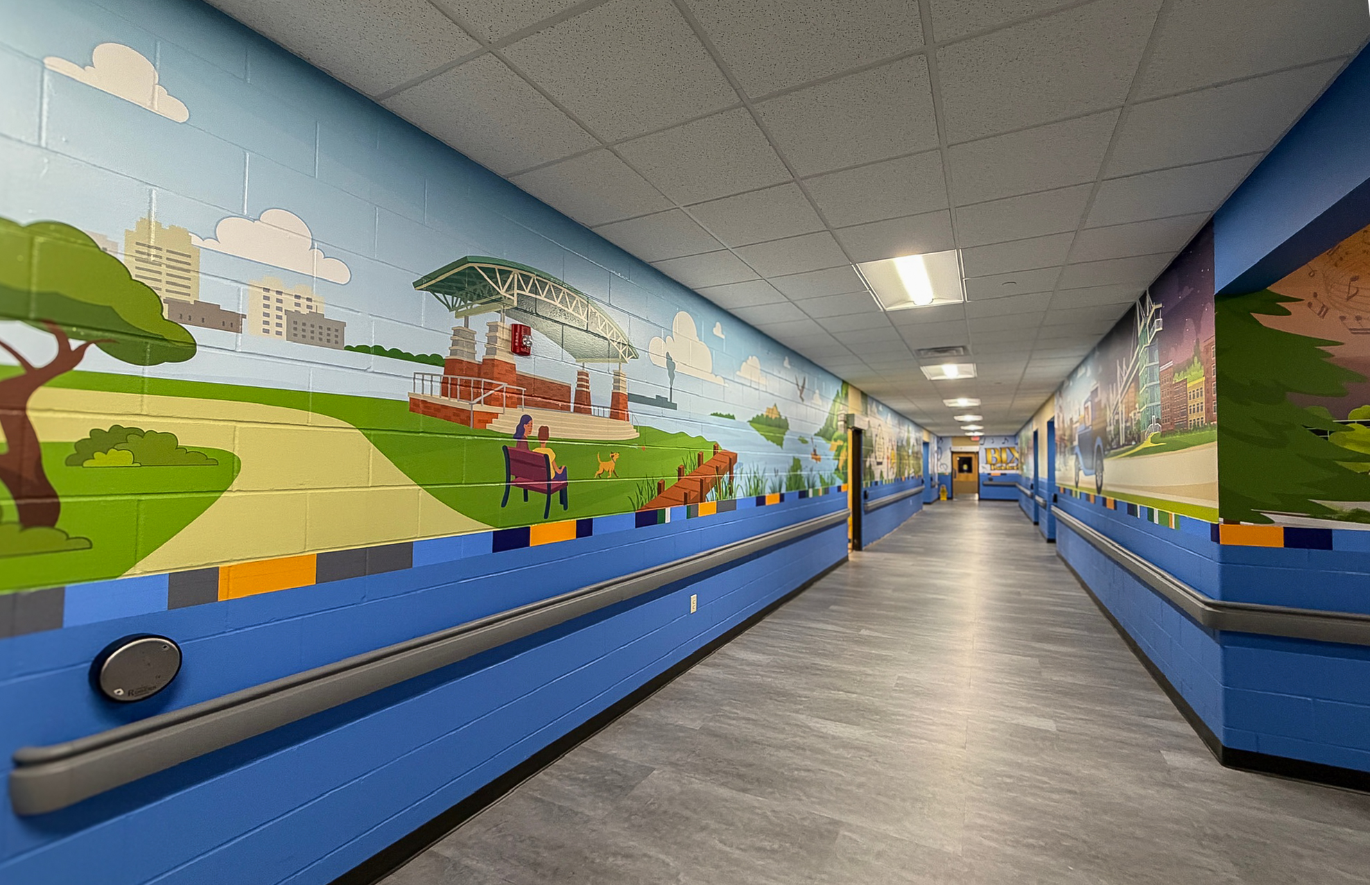
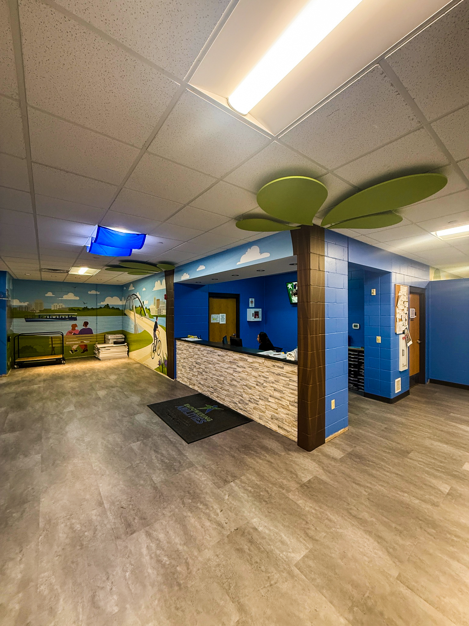
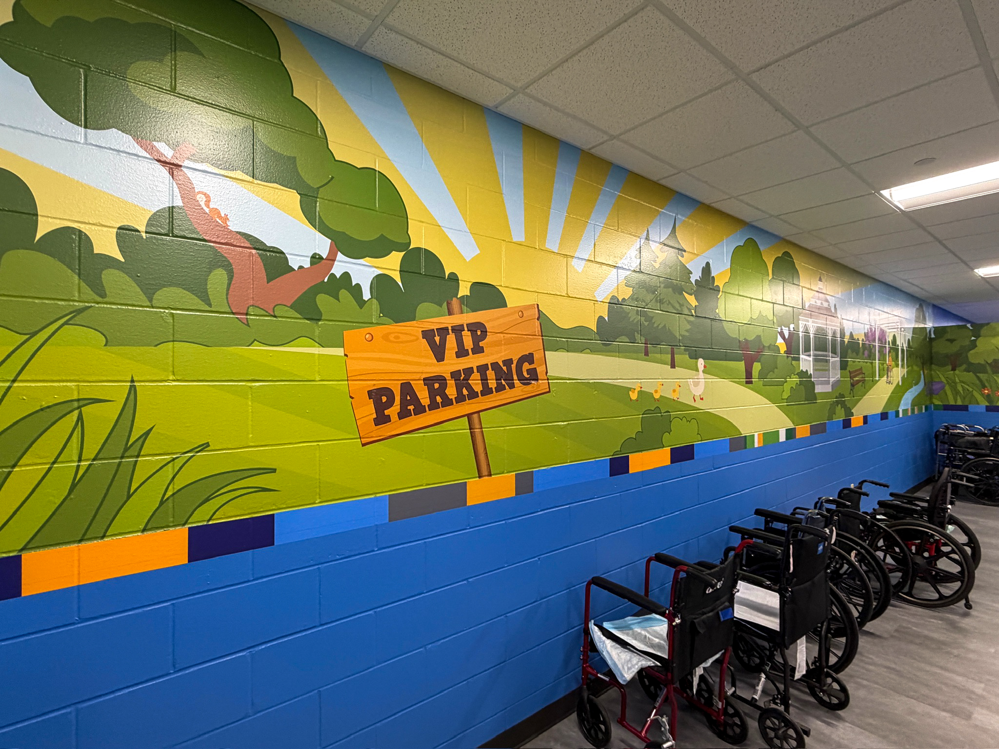
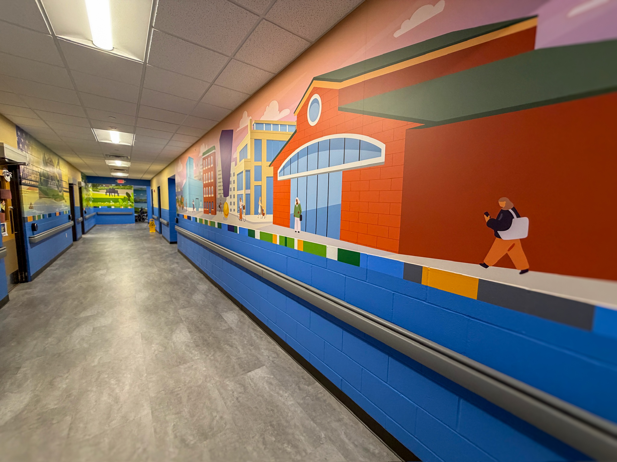
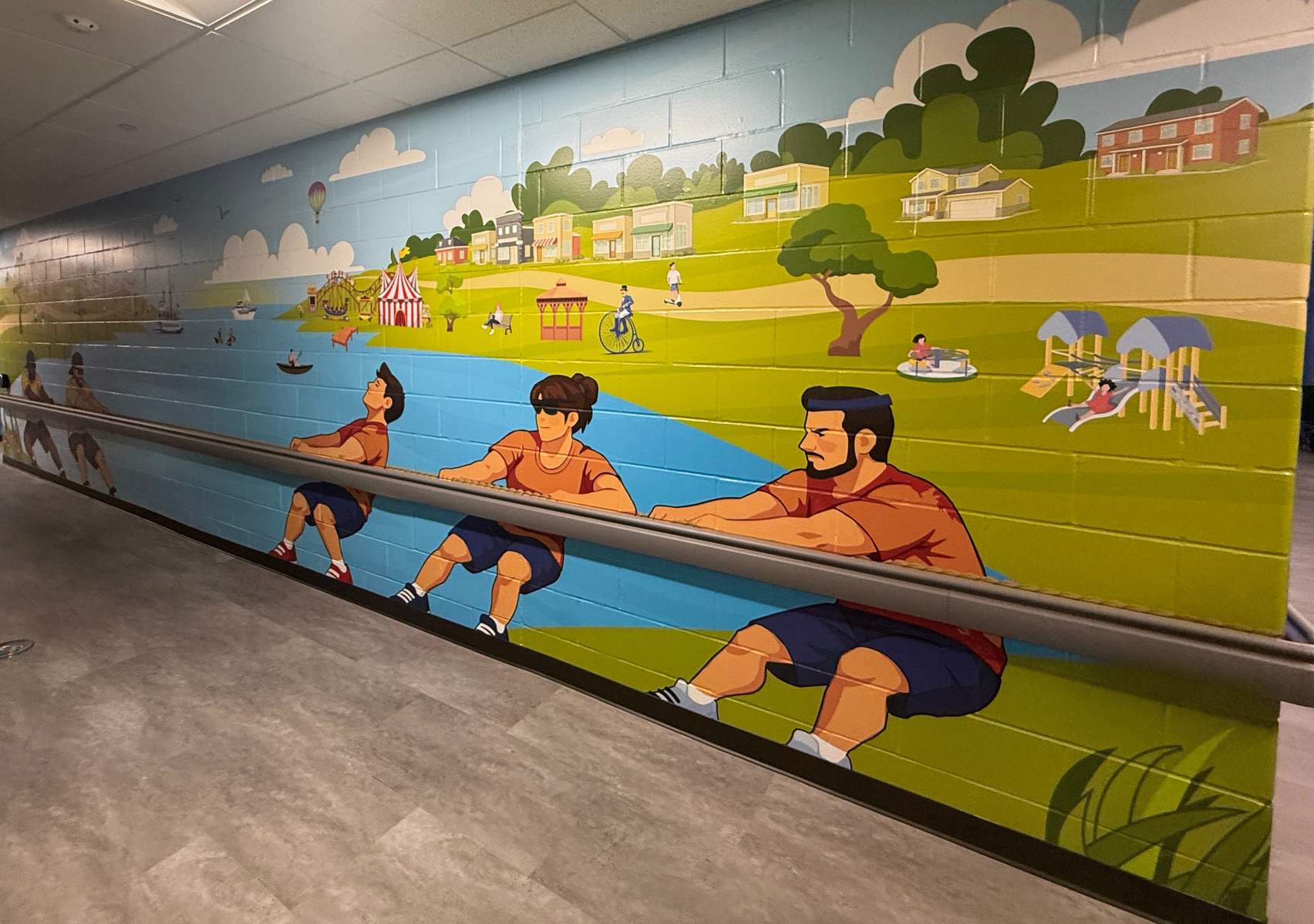
The design team at Edwards Creative designed and illustrated environmental graphics that connect recognizable Quad Cities moments to a long corridor through bright color and themes. The murals adapt around doors, corners and architectural interruptions while maintaining continuity throughout the space. The result gives an everyday passage a more welcoming character, with distinct Quad Cities moments along the way.
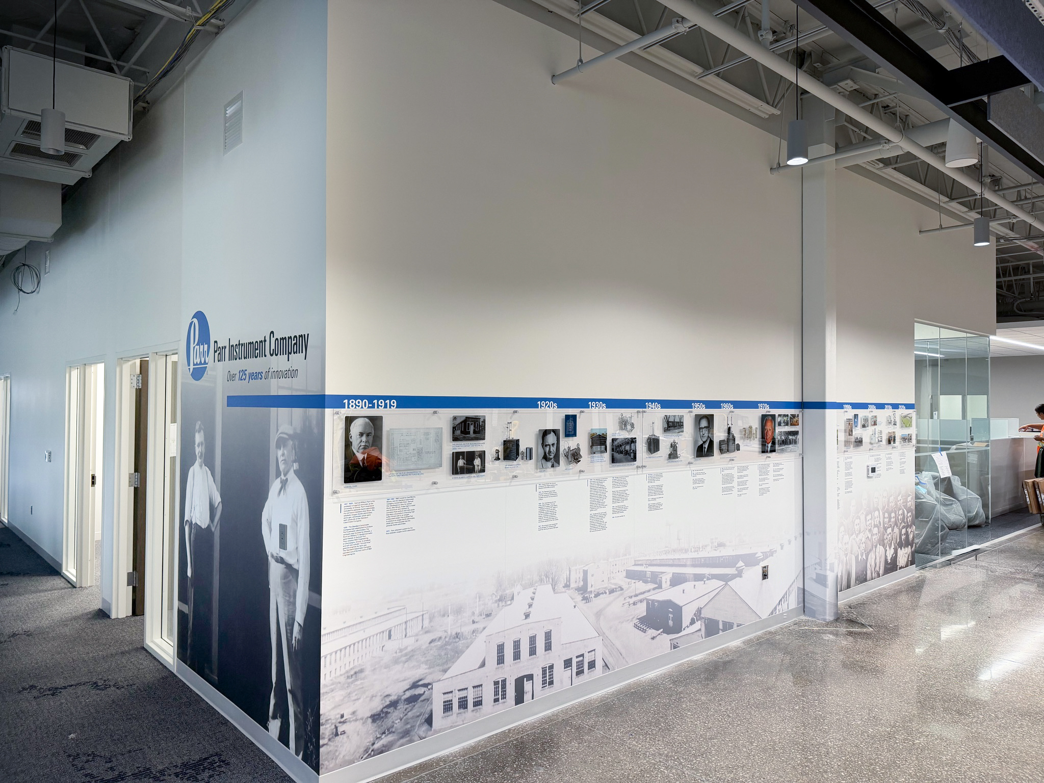

I designed a long-format timeline that integrates Parr Instrument Company’s history into its workplace. A diagonal composition creates movement along the wall, and clear hierarchy connects dates, imagery and individual milestones. The restrained graphic treatment gives substantial historical content a coherent structure that works with the headquarter's architecture.
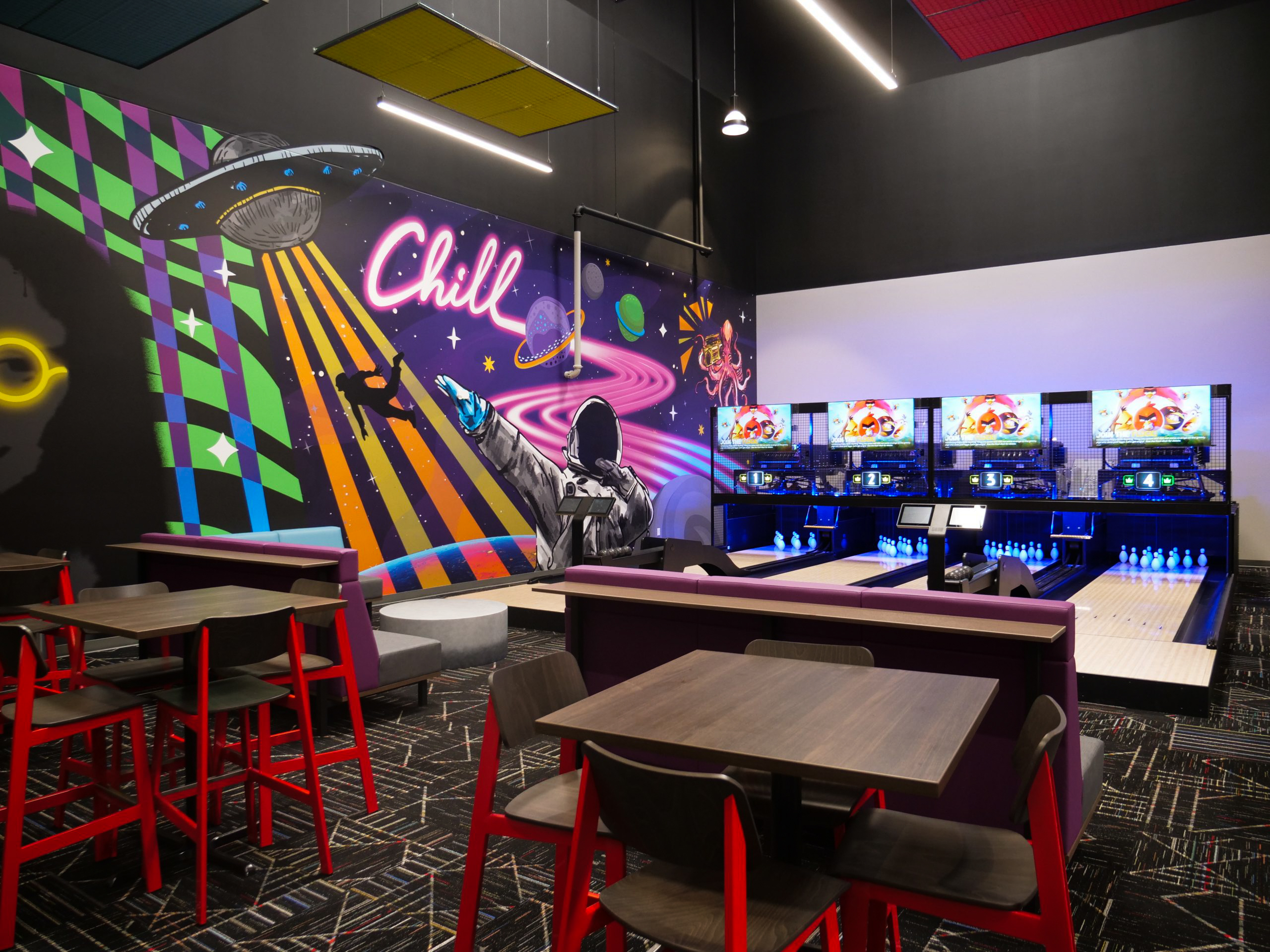
I designed bold, psychedelic wall graphics for Fun City’s Duckpin Bowling environment. Color and pattern give the space a lively character, with large-scale artwork creating a continuous visual backdrop, giving the bowling experience a distinctive personality of its own.